Written by
on
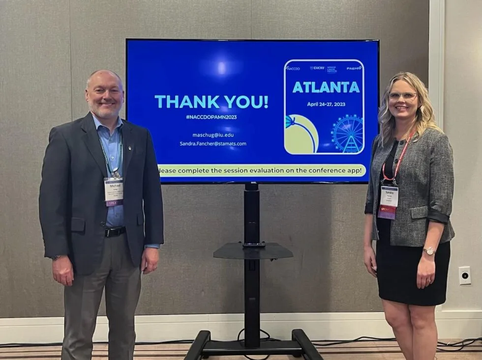
In April, I had the opportunity to present at NACCDO-PAMN Annual Conference with Michael Schug from Indiana University Melvin and Bren Simon Comprehensive Cancer Center. Our presentation covered the challenges of building an audience focused site in a complex academic medical center environment.
One of the most relevant points Michael and I shared is this: create the site for the user, not for your org chart. And when you do that, they will come (yes, I’m from Iowa, not far from the Field of Dreams).
There are two really great examples of areas that were originally focused on the department content. The team at IU was ready to make a change so there was no pushback; their site was dated and everyone was aligned to an audience-based site to message #ResearchCuresCancer.
Giving – Audience Focused Content
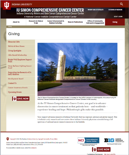
For more than a decade, the cancer center’s Giving page directed potential donors to an institutional landing page. Instead of actionable content, users had to make their way through unfocused side navigation that had grown over time. If visitors found the giving fund they were interested in, the page was likely too long or too short to impact their decision.
It was focused on who they were, not the amazing impact they have had on research.
Our strategy to create an engaging page:
- Emphasize donor impact—tie funding opportunities directly to related research
- Elevate key donor interests
- Add patient survivor stories
- Include researcher photos and testimonials
- Cross-link event and volunteer pages
The outcomes:
- Direct connections between donors and research breakthroughs
- Personal stories of high-profile scientists
- Multiple voices sharing consistent key messages
The results:
- 53% increase in pageviews for the Giving section since launch (January 2023 to January 2022)
- Significant engagement with landing page calls to action

Community Outreach & Engagement – Audience Content
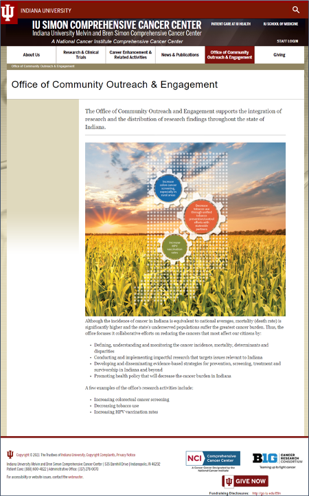
The original Community Outreach & Engagement web page consisted of a rural landscape graphic and a high-level synopsis of the department’s official mission and goals. And that was it—a single page with no branding and no calls to action. This office was doing amazing things, and the page was not telling their story!
After lively interviews with the OCOE team, it was clear that community outreach and engagement are vital to cancer research, and they were ready to share that message and build community connections.
Our strategy to create an engaging page:
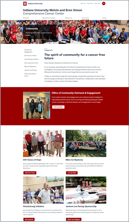
- Expand to a full section
- Shorten navigation label to “Community” to de-emphasize org chart influence
- Surface key messages and stories from social media
- Integrate Simon Says video series and promote across the site. The team had invested in this really helpful channel, but it was orphaned on their website as a standalone page—and that meant the community was not accessing this information
- Move events and volunteering from Giving to Community and reframe content to highlight community impact
- Show the full spectrum of diversity across Indiana with lots and lots of people photos
- Give a voice to the OCOE team—all-new content emphasizing the scope of their work—engagement statistics, community partners, research articles
The section outcomes:
- Clear user journeys
- Prominent calls to action
- Meaningful images
- Strong voice
The results:
- Increased engagement within the site: moved from 24th to 6th in clicks from homepage
- Simon Says video series now accounts for 47% of traffic through Community section
Visit the Community & Outreach page live
Takeaways and Recommendations
Write for the audience. This most likely means it won’t look like your org chart. A department’s content might live in more than one navigation menu item.
A frequent real-life example I share is one we are all familiar with. At the grocery store, the aisles are not aligned by the company products. There is no General Mills, Post, or Nestle aisle. The aisles are aligned by product category, spreading their brands over multiple aisles. Why do stores do this? It’s best for the consumer, and what is best for the consumer is best for the store.
Tell your stories. Dig deep during the discovery process. Let the subject matter experts talk during stakeholder interviews. Find out what excites them and who the “unsung heroes” are. Listen closely and pull out the threads of recurring themes.
Make the connections. Craft key messages that weave together those story threads using your unique voice and tone. Use design components to guide users through their journeys. Give them opportunities to answer the calls to action and discover related content. Make use of dynamic content to maintain the momentum.
