Stamats Insights
April 27, 2020
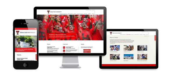
Your homepage is like a branded shop window for prospective consumers.

It shows a digital passersby who you are, what you do, and what you offer.
In 2020 and beyond, homepage aesthetics and functionality are equally important. A poorly executed homepage can be just as detrimental to your brand as dirty windowpanes.
But fear not—you can achieve homepage zen with the right balance of navigational finesse, optimized images, and scannable content.
Use these 10 key elements to attract and retain prospective consumers who are searching for your services, solutions, and offers like yours.
Your websites navigation, also known as the menu, is one of—if not the—highest-trafficked areas of any website.
Here, consumers expect you to highlight your website’s most important aspects. Failing to do so can frustrate your audience, who will bounce out due to the poor user experience.
Use your site analytics to determine which pages are most visited by new and returning users. The top pages should be strategically surfaced to your site navigation. Unsure which webpages or aspects to highlight? Schedule a free consultation with a Stamats UX expert.
Many times, the hero image is where the user experience starts. Typically, hero images or banners expand the full width of the browser window and take up large portions of the homepage.
The major presence of photos and/or videos brings attention to your products. You can also add catchy headlines and a CTA button to guide visitors to other key sections of your website.
What makes your company unique? How does it stand out in your crowded marketplace? If you don’t show the answer, how will your visitors know?
On your homepage, highlight what makes your company different from competitors. Illustrate your uniqueness through the website using photos, videos, or infographics.
Notice how I didn’t mention stock photography? Ew!
Stock photos are nice if you’re in a pinch and need a place holder. But if you expect paying consumers to remember you, consider options beyond a stock image that anyone with $50 can buy. Organic, unique, high-quality photos showcase your services better long-term than any stock photo could.
Remember to optimize and compress your photos. Use lightweight image files to help Google bots crawl and index your images. This allows your website’s organic traffic and online presence to grow daily.
A critical item to consider is how this will impact your website’s overall load speed. According to research from Google, 53% of website visits are abandoned if a mobile site takes longer than three seconds to load.
In today’s busy world, few people read full pages of content. They rely on clear and catchy headlines to scan the page for information they need and skip what they don’t.
Website visitors should be able to quickly understand what you offer and your services by scanning your headlines and subheadings. These queues are your chance to grab your audience’s attention and increase your online ranking and on-page SEO.
It’s important your website’s content stays fresh not only for your customer base but also to help Google bots crawl your website and obtain the latest information.
Consider scheduling a monthly governance reminder to keep your content updated. Check and revise your assigned section of website regularly to keep it up to date with the latest audience needs. Want governance advice? Schedule a free consultation today.
Focus your content on how customers can benefit, not all the awesome awards you’ve won. Dedicate a small (not too small, haha!) section of your About Us page to highlight your accomplishments as a tasteful selling point.
Also, include your business phone number, location, and hours of operation within your homepage content or in the footer so it shows on every webpage of the website.
Website users are at different stages of their user journey, which is why it’s important to include content offers, such as whitepapers and ebooks.
A website visitor may not be ready to buy, but they may be ready to download. Make sure to include a relevant next step and call-to-action on the downloadable piece, along with your email address and phone number.
Customer reviews are extremely important to gain credibility and get more traffic. When new visitors see reviews from current and previous customers, their trust level increases. With trust comes added confidence in their decision to do business with you.
Websites often lose potential buyers if they fail to integrate a contact form into their website. A working contact form allows potential customers to email you directly from your website, creating a low-pressure user experience. Lead generation increases when users are satisfied with their experience.
Social media is a world of its own. Integrating Twitter, Facebook, or Instagram into your website affords you new engagement opportunities. In the digital age, all audiences expect brands and companies to be on social media.
Put thought into the strategy behind your homepage design and layout. Incorporating these 10 elements will put you on the right track to feng shui your user’s experience and direct them to the content they need to convert.
Is it time to update your homepage user experience? Schedule a free consultation now.
Ready to Get Started?
Reach out to us to talk about your strategy and goals.